Running a successful concession trailer business relies on much more than just great food and excellent service; the right visuals are essential for attracting customers and building a memorable brand. High-quality, well-designed graphics on a concession trailer can make a significant difference in brand perception and customer engagement. Here’s a deep dive into creating effective business graphics for concession trailers, answering important questions that can guide your design choices.
Why Are Graphics Essential for Concession Trailers?
Graphics on a concession trailer serve multiple purposes beyond just being visually appealing. They communicate your brand’s personality, advertise your offerings, and help your trailer stand out from competitors. Good visuals catch potential customers’ attention and convey the quality, creativity, and type of food or service offered. Clear, high-quality graphics can also inspire trust and make a strong first impression, crucial in busy locations where people make quick decisions about where to eat.
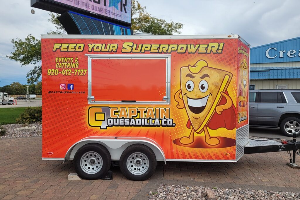
A well-designed graphic layout on a concession trailer acts like a mobile billboard, with the potential to draw in customers from a distance and leave a lasting impression. When done right, graphics can help build brand recognition over time, especially for trailers in high-traffic areas like fairs, food truck festivals, and sporting events.
What Are the Key Elements to Include in Concession Trailer Graphics?
When designing graphics for a concession trailer, certain elements are crucial to maximize effectiveness. Here are some primary components to consider:
- Logo: This is the centerpiece of your brand identity. A recognizable, professional logo ensures that people remember your brand and sets the tone for your trailer’s overall design.
- Product Images or Illustrations: Include images of your best dishes or services to let customers know what they can expect. However, ensure these images are high-quality and visually appetizing.
- Colors: Choose colors that reflect your brand and stand out in a crowd. Bright colors often work well for food trailers but consider your brand personality—pastels, for example, can work for dessert trucks, while earthy tones might suit a health-focused vendor.
- Text and Typography: Clearly display your business name and a tagline if possible. Use bold, easy-to-read fonts and limit text to essential details, such as your social media handle or website.
- Contact Information: Don’t overlook adding ways for people to reach you, whether it’s a social media handle, phone number, or website. Social media handles can help build a following and encourage repeat customers.
How Do I Choose the Right Graphic Materials?
The type of materials used for graphics on concession trailers is crucial since these trailers operate outdoors and are exposed to various weather conditions. Here are the top material choices:
- Vinyl Wraps: Full vinyl wraps are popular for concession trailers as they’re durable, customizable, and weather-resistant. They allow for full-color images and can cover the entire surface of the trailer, making your graphics visible from all angles.
- Magnetic Signs: If you prefer removable graphics, magnetic signs are an option. They don’t offer as much design flexibility or surface coverage as vinyl wraps, but they allow for temporary branding if you want to switch up your look.
- Perforated Vinyl for Windows: Some concession trailers have windows, which can limit design space. Perforated vinyl allows graphics to cover windows without blocking the view from inside, enabling a continuous design while maintaining visibility.
Each material has its pros and cons, and the choice ultimately depends on your budget, durability needs, and aesthetic goals. Vinyl wraps are generally the best choice for a permanent, polished look, but magnetic signs are a more affordable option if you’re starting out.
What Are the Design Best Practices for Concession Trailer Graphics?
Creating an effective design for a concession trailer requires strategic thinking. Here are some best practices to keep in mind:
- Prioritize Readability: Avoid cluttered designs that can be hard to read from a distance. Use bold, large fonts and contrast between text and background colors to improve readability.
- Focus on Brand Consistency: All elements, including colors, fonts, and images, should be consistent with your brand’s style. This consistency strengthens your brand identity and makes it more memorable.
- Ensure High-Quality Imagery: Low-quality or blurry images can reflect poorly on your brand. Use high-resolution images for professional appeal, as they’ll look sharp even when enlarged on a trailer wrap.
- Think About Placement: Place key elements (logo, images, website) on parts of the trailer that are most visible, like the sides and back. Keep in mind that certain parts of the trailer, like doors and windows, might obstruct visibility.
How Can I Make My Trailer Stand Out from Competitors?
With so many food trailers competing for attention, standing out is essential. Here are some strategies to differentiate your trailer through graphics:
- Highlight Unique Selling Points: If your business has a unique angle (e.g., organic ingredients, vegan-friendly options), display it prominently on the trailer.
- Integrate Lighting: LED-lit signs or accent lighting around graphics can make your trailer visible at night, enhancing the overall look and attracting late-night customers.
- Add Interactive Elements: QR codes linking to your social media or website can engage tech-savvy customers and encourage interaction. Adding unique elements, like character mascots or witty slogans, can also leave a memorable impression.
Should I Hire a Professional Designer?
While some business owners opt for DIY designs to save on costs, hiring a professional designer can be a worthwhile investment. Designers understand layout, branding, and color theory, which can make a significant difference in creating eye-catching graphics that fit your brand. If your budget allows, working with a professional can save time, ensure a high-quality look, and help your brand achieve a polished and cohesive appearance.
What Are the Maintenance Tips for Trailer Graphics?
Once you have the perfect graphics, maintaining them is essential to keep them looking fresh. Here are a few tips:
- Regular Cleaning: Gently clean the graphics with mild soap and water to remove dirt and stains, but avoid harsh chemicals that might damage the vinyl.
- Check for Peeling or Damage: Over time, edges might peel or fade due to weather exposure. Periodically inspect your graphics and repair or replace damaged sections as needed.
- Store Trailer in a Covered Area: If possible, store your trailer in a shaded area or cover it when not in use to prevent sun damage.
Conclusion
Creating effective business graphics for a concession trailer is an investment in your brand’s visual identity. By prioritizing high-quality materials, working with a designer, and maintaining the graphics, your trailer can become a mobile advertisement that draws in customers and sets you apart from the competition. With thoughtful design and strategic placement, your concession trailer can become a recognizable and inviting spot that attracts customers wherever you go.


